|
When designing Office Timesheets, we wanted to ensure that although all of the features
and options that the application offers are endless, the application itself needed
to remain easy to use and understand. With that in mind, we looked to what type
of applications that many users already know and comprehend. The result was designing
a software application that mimics Microsoft Office, which translates into
a familiar platform environment and less training time for end-users. Thus, it's no
surprise to see that Office Timesheets is designed with the same look and feel of Microsoft
Office .
Basic Navigation in Office Timesheets
In the majority of programs that most people are familiar with, menus and sub-menus
are the way of navigating in and around the application. However, users often discover
that the functions that they need are hidden too deep in sub-menus and dialog boxes to be found easily.
The Office Timesheets interface does the exact opposite; there are no hidden menus.
Instead, Office Timesheets is organized into tabbed sections with each
tabbed section exposing all functions in a grouped ribbon. So forget searching
through endless sub-menus to find what you need; Office Timesheets quickly reveals all the
functions you need to achieve what you need done more efficiently.
Key Features
Office Timesheets' easy web interface encompasses many useful features, all of which
are centered design-wise using the Office fluent-style interface. Here are some
of the key features which make Office Timesheets easier to use:
|
Tabbed Sections v. Drop Down Menus
Out with the old and in with the new. You probably never realized it, but finding functions
embedded deep in drop-down menus probably took more time than you think, which in turn took
time away from accomplishing important daily tasks. Office Timesheets breaks all
the functions you need into groups, and those groups are organized into separate
tabs. The tabs appear clearly on your screen so finding a particular relevant function
is quick and easy. For example, by clicking on “Reports” a user can immediately
see all the functions available that relate to reporting.

|
Ribbons within Office Timesheets
The functions that display within a ribbon in Office Timesheets are completely dependent
and relative to which tab is active. For example, the “View Sheets” tab displays
a ribbon with all functions related timesheets, expense sheets and their entries.
This promotes quicker user acceptance and understanding of the application, which
renders a more productive environment with faster results. No functions are hidden from view
(dependent upon a user’s security policy), so there is no guess work involved
in the process.

|
Contextual Functions and Options
In addition to tabbed sections and visible ribbons of functions, the options that
show within these functions are dependent upon other options chosen. For example,
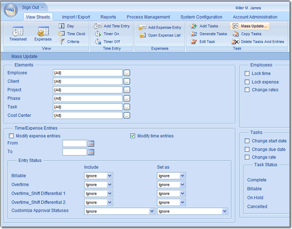
if you choose the "Mass Update" function, several options appear within the interface which offer
additional options under those if you choose its appropriate parent option. In this
particular example, you would see many options, one being to "Modify time entries."
Normally, nothing appears below its checkbox. However, if you check the "Modify
time entries" checkbox, a variety of additional options appear that relate to modifying
time entries. This feature not only eliminates a cluttered view; it also creates
easier user experience and prevents any confusion.

|
Instant User Acceptance
These unique features that support Office Timesheets’ intuitive web interface guarantee
that users will be comfortable with its clear-cut design and navigation. The goal
of Office Timesheets is to deliver quick and accurate time and expense data management
by offering the application’s powerful features in an understandable format. Ribbons,
tabs, and contextual functions have replaced the out-of-date menus that hide even
the most frequently used functions, so users can achieve what they need quickly
and easily.
|